Friday, 16 December 2011
Thursday, 15 December 2011
Making Of Digipak: Thursday 15th December
In today's lesson I managed to scan the painting things I done then open them on Photoshop.
The colours look really effective against the black background
I then went over the paint to cut out all the white background I miss, and to thinning out some of the lines as they looked a bit to big.
For the inside panels I cut out the picture of Shannon and tuned him in to a grey silhouette.

For the front cover I opened the other bit a paint spatters, and the picture of Shannon I was planning on using.
However in the end I decided not to use the photo, as i feel it looks to much with the paint as well. So for the front cover I will just have the black background with with the paint design. It works as it still fits in with the genre of my music and i plan to mack a little booklet that goes with the Digipak that will introduce the artist some more.
As you can see i'v also edited the track list, added on the website, copyright information, and the parent advisory logo.
Mock up
My final Cover and Back of my Digipak.
 |
| Screenshot of photoshop. |
As you can see this digipak is completely different to my original one. My layers were all messed up on the other one and some how I lost it all, so I had to copy what I done all over again from a screen shot and use a different picture and colour in the background behind it black without cropping it...Yeah.. I also added in the parental advisory in and wrote some things on the back. The producers and the company etc. I also changed the spine as I found out I had to add in the name of the album. So I changed it and wrote the artists name, album name and company name.
Therefore, in my conclusion, i have finally finished my front and back panel of my digipak after forever. When i get back to college. I'm planning on using that first week to produce the advertisement and the inside on the digipak.
Wednesday, 14 December 2011
Monday, 12 December 2011
My digipak so far and my problem with it.
The picture I used in this digipak caused me a few problems as I was unable to crop shannon out without making him bald. As I took the picture on a black background I could not crop him clothes properly either, which is why i had to change the picture overall. all the pictures i used were taken on a dark background so my only option was to use a close up picture of shannon's face and to colour in the background black and not crop the picture at all. This was fun colouring it in as i got a giggle out of it with my group. They also had the same problem, so we all coloured together :)
Making The Digipak: Monday 12th December
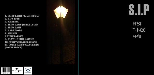
So in today's lesson I officially started making my digipak on Photoshop. I decided on the font 'Canard-Regular - 106px' as it was bold and clear enough to read and stand out, fitting in with the conventions of digipaks, but also had a slightly rough graffiti look that fit in with the Dupstep genre :)
As you can see I didn't get that much done as i'm not that confident on Photoshop so slightly slow! So far i'v set the black background, got down most of the text, barcode and the production companies logo. I did add in the picture of Shannon but it look bad to say the lest! This was because I took the photo against a white background so it was quite hard to cut. Therefore I might have to persuade Shannon to have another mini photoshot against the green walls in college.
Screenshots of my photo shop editing process
I started of with a blank 2 panel. I changed the colour black and put in white writing of the track list. I had to start with the back panel because i still needed to get my pictures from isla's camera. The font i used was alexandria.
I then got a ram records label and a barcode to put on the back. I also wrote on the spine of the Digipak which said S.I.P several times.
I had to chose which one of these logo's I would use. I felt the one on the above left was better than the one on the above right, because it was more clearer.
After i added in the picture, this is what my front and back panel looked like and this was the picture I was using.
Subscribe to:
Comments (Atom)


