
Monday, 16 January 2012

Evaluation Q2.
How effective is the combination of your main product (video) and ancillary text (digipak and advertisement)?
Although there is no obvious visual links between my ancillary work and the music video like photos of the artist of clips from the video. I feel they do still have a slight link. I used the paint splash to link in with the glow sticks and the city lights seen in the video.


As for the two ancillary products i feel there is a very strong link! Using the same background, text and patterns. I hoped my target audience would see the slight link between all my work. Here's what they had to say:
(vid)
Evaluation Q1.
In what ways does your media product use, develop or challenge forms and conventions of real media products?
I feel our video really follows the conventions of a music video that I previously researched. For example, it fits in with Vernallis theory of the camera and editing moving in time with the music and using many edits that are dilibrate and notisable to draw attionation to what on screen. Below I have shown some clips where our video uses these edits similar to music videos we looked at:
We also followed Goodwin's theory, choosing to use amplification, where we had a slight story/ meaning that fitted in with the music, but not a full storyline like illustration. We anaylised the liyrics "The music thay we play will ease your mind" and decided a party scene would show the meanin, we then took the lyrics from the verses such as "I am a man with a lonely heart" and came up with the idea to have the artist showing hes quite down and emotional, then the music at the party 'eases his mind'. So there is a slight story, but not full illustration.
I feel my media products both the music video and ancillary work stick to the conventions and style of the genre we choose.
For our music video took loads of inspiration form several artist and music videos, for example:
In the first 2 chorus we had Shannon walking down a street at night, and then again on London bridge by the river. We got this idea from Jamie T's music video for Sheila,


We felt this location was perfect as the darkness of the night reflected the Artists sad mood at the time, but also brought out the colourful light of the city, which we felt linked in with the brightness of the glow sticks at the party.
For the party scene we took inspiration from a number of videos including; DEV - Bass Down Low, Chase & Status - Pieces and JLo - On The Floor.
We used a similar shot to DEV's with Lashmi singing in front of the camera with people partying behind her. We liked the shot as it showed the chaos of the party and people having fun enjoying the music.


We liked the camera work used in Pieces by Chase & Status, its fast, handheld and chaotic, which reflects the music genre and the atmosphere we where trying to create:
Toward the end of this video we also felt that the artist (Plan B) walking down the street, with lots of overlaid edits worked really well to express his emotion as well as really fitting in with the music and tried to create a similar effect, but slowed down, when editing our chorus of Shannon.
The other editing effect we used was having Lashmi's face almost transparent with the party scene behind her. We first saw this effect used in JLo's video and felt it would work really well in making our video more visually interesting.


 Due to all the research and inspiration we took from club music videos our music video looks very conventional to the genre. It also has elements that are conventional to pop video in general. For example editing to the beat, something that all conventinal pop video do. We also made a clear split between the verses and chorus using completely different scenes aiming for a different atmosphere between the two, which is scene in many conventional pop videos. We wanted to really establish the artist S.I.P with the main focus on him, he features in almost all scenes and we even see his brand on his hoody. We have used loads of shot with him signing directly into the camera to build a connection with him and the audience. Although the there is a featuring artist (which is common in pop videos) the main focus is on him, highlighting him as the lead and creating his image and identity.
As for my Digipak I looked at several CD covers in the same Dubstep / DnB genres. I found that the majority of them used bright colours, and focused more on the design and colour then a photograph. This is where i got the idea of creating brightly coloured paint splashes to use against a plain background.

As you can see from my initial design I wanted to use a Photo of Shannon on the cover. But after trying it out I felt it worked better keeping it simple and uncluttered. Reflecting back on the covers I looked at it is quite conventional for Dubstep artist to not use themselves on there cover.


Here is my final digipak:


I feel it is quite realistic to what a Dubstep digipak should look like. Sticking to a simple design focusing mostly on the colour. The bright paint splashes could reflect glow paint/ sticks seen at raves and party's where this genre is played. I choose this font as it is bold and easy to read making it easy to read and stand out, but also because it has a slight graffiti effect to it which reflects the urban feel that has influenced the album.
Here is my final poster:

Yet again I choose not to use a photo, wanting the poster to link in with the digipak. I feel my poster is very conventional to artist from a similar genre. For example:

This poster from the original artist Chase & Status uses a simple layout with clear writing, clearly displaying all the info for what there advertising, in this case there tour. I used a similar layout only promoting the album instead. I choose the same font used in my digipak, yet again to keep the two relatable, and it worked well to stand out.
They to have used no photo of themselves opting for a picture of a British bulldog that's used on there No More Idols album and is also there logo.

Caspa's poster is very similar to mine, using splashes of paint, and having the writing at a slight angle. This all relate to the genre of music showing that is loud and lively.
So all in all I feel my ancillary work are very conventional.
I feel our video really follows the conventions of a music video that I previously researched. For example, it fits in with Vernallis theory of the camera and editing moving in time with the music and using many edits that are dilibrate and notisable to draw attionation to what on screen. Below I have shown some clips where our video uses these edits similar to music videos we looked at:
We also followed Goodwin's theory, choosing to use amplification, where we had a slight story/ meaning that fitted in with the music, but not a full storyline like illustration. We anaylised the liyrics "The music thay we play will ease your mind" and decided a party scene would show the meanin, we then took the lyrics from the verses such as "I am a man with a lonely heart" and came up with the idea to have the artist showing hes quite down and emotional, then the music at the party 'eases his mind'. So there is a slight story, but not full illustration.
I feel my media products both the music video and ancillary work stick to the conventions and style of the genre we choose.
For our music video took loads of inspiration form several artist and music videos, for example:
In the first 2 chorus we had Shannon walking down a street at night, and then again on London bridge by the river. We got this idea from Jamie T's music video for Sheila,

We felt this location was perfect as the darkness of the night reflected the Artists sad mood at the time, but also brought out the colourful light of the city, which we felt linked in with the brightness of the glow sticks at the party.
For the party scene we took inspiration from a number of videos including; DEV - Bass Down Low, Chase & Status - Pieces and JLo - On The Floor.
We used a similar shot to DEV's with Lashmi singing in front of the camera with people partying behind her. We liked the shot as it showed the chaos of the party and people having fun enjoying the music.

Toward the end of this video we also felt that the artist (Plan B) walking down the street, with lots of overlaid edits worked really well to express his emotion as well as really fitting in with the music and tried to create a similar effect, but slowed down, when editing our chorus of Shannon.
The other editing effect we used was having Lashmi's face almost transparent with the party scene behind her. We first saw this effect used in JLo's video and felt it would work really well in making our video more visually interesting.
 Due to all the research and inspiration we took from club music videos our music video looks very conventional to the genre. It also has elements that are conventional to pop video in general. For example editing to the beat, something that all conventinal pop video do. We also made a clear split between the verses and chorus using completely different scenes aiming for a different atmosphere between the two, which is scene in many conventional pop videos. We wanted to really establish the artist S.I.P with the main focus on him, he features in almost all scenes and we even see his brand on his hoody. We have used loads of shot with him signing directly into the camera to build a connection with him and the audience. Although the there is a featuring artist (which is common in pop videos) the main focus is on him, highlighting him as the lead and creating his image and identity.
As for my Digipak I looked at several CD covers in the same Dubstep / DnB genres. I found that the majority of them used bright colours, and focused more on the design and colour then a photograph. This is where i got the idea of creating brightly coloured paint splashes to use against a plain background.

As you can see from my initial design I wanted to use a Photo of Shannon on the cover. But after trying it out I felt it worked better keeping it simple and uncluttered. Reflecting back on the covers I looked at it is quite conventional for Dubstep artist to not use themselves on there cover.


Here is my final digipak:
I feel it is quite realistic to what a Dubstep digipak should look like. Sticking to a simple design focusing mostly on the colour. The bright paint splashes could reflect glow paint/ sticks seen at raves and party's where this genre is played. I choose this font as it is bold and easy to read making it easy to read and stand out, but also because it has a slight graffiti effect to it which reflects the urban feel that has influenced the album.
Here is my final poster:

Yet again I choose not to use a photo, wanting the poster to link in with the digipak. I feel my poster is very conventional to artist from a similar genre. For example:
This poster from the original artist Chase & Status uses a simple layout with clear writing, clearly displaying all the info for what there advertising, in this case there tour. I used a similar layout only promoting the album instead. I choose the same font used in my digipak, yet again to keep the two relatable, and it worked well to stand out.
They to have used no photo of themselves opting for a picture of a British bulldog that's used on there No More Idols album and is also there logo.
Caspa's poster is very similar to mine, using splashes of paint, and having the writing at a slight angle. This all relate to the genre of music showing that is loud and lively.
So all in all I feel my ancillary work are very conventional.
Thursday, 12 January 2012
Lashmi Gemma Kaur Evaluation Q3
3. How did you use media technologies in the construction and research, planning and evaluation stages?
Unable to upload Animatic for some reason......
I used Sites on the internet such as:
YouTube: I used you tube almost everyday because i would need inspiration for my music video. My group and I kept changing our song choice, so we had to constantly be on you tube looking at music videos and searching for the right songs for us.

Vimeo: Vimeo is kind of like You Tube. However, the majority of videos that were posted on there were student made. It was okay to put videos on here and was useful, as we were not allowed to upload our videos onto You Tube or Facebook, unless we had copyright permission. It was also a easy way to access other students work, being interested in what other students ideas and song choices were.

Blogger: Where do I begin? I've been using Blogger for two years now and I'm so sick of it! Blogger was a way to research, plan and produce our music videos and ancillary work, without the confusion of paper work. It was an easy thing to use and it was interesting on how it worked. I loved uploading screen shots, pictures and videos onto Blogger as it was the most easiest thing to do. Blogger was very useful for this course, as it is a well organised site for students to use, i mean could you imagine us blogging on paper? I'd have a huge pile by now. But Blogger was also a good way for our teachers to see our progress, so that was good too.
Prezi: Prezi is kind of like Power point. It;s like a brain storm of information that you make into a short clip. I personally never liked or used prezi.
Google: I was always googling Artists when I was planning and researching, so that I could get more information. Google is the best!
+Google Images: It was always useful. I got my bar code and parental logo from Google images. It was always fun looking at pictures of artists and their digipaks.
Then I used software such as:
Final Cut Pro: I have been using Final Cut Pro for three years now. I have produced a Soap opening, a Thriller and a music video by using it. i have also used final cut pro to make many small videos. I used things such as fades and dissolves frequently. I used soundtrack pro making my thriller. however, this year we just put a song onto the timeline. No Long Ting. I also used live type, but just not this year. Final cut is very useful and the quality of the software is great.

Photoshop: Photoshop was what i created my ancillary work on. It enables me to crop pictures, edit the colours etc. (Coloured in the background)!
Movie Maker: I used movie maker to make home made videos as part of my supplementary blogs.
Photo Bucket: It always confused me so i never used it.
Quark express: Screen Shots: Taking screens shots of my work was my most favourite thing to do on the macs. It was so easy to use, and when i needed to upload quick information onto blogger, all i would need to do is screen grab, and i was good to go.

Hand Brake: Hand Brake was used constantly to change the format of videos. I would have to change the video into an mp4 just so that it could be uploaded onto blogger.
Font case: Font case helped me to decide what font I wanted to use with my ancillary work.
JVC Camera: The most important piece of technology used and remember, it is worth more than my life, because if we broke it and had to pay 3 grand, my life would be over full stop! It was great filming with them. The tripod made it easier to film with, as it helped keep the camera still to get a still clip. But that's not a piece of technology. The JVC had a battery and two slots for the memory cards to fit in. I used Neutral Density filter on the camera, so that there was enough light in the night time and party shots. I switched it on and used the manual focus for each shot. I would zoom in and out to make sure the camera was in focus.
Flip Camera: I was always running around with one of these filming last minute things as part of our group work, when even we needed to update our blog, instead of typing essays, we would just run and get a flip, you never had to hand brake it which was great. all you had to do was plug it in the mac and upload it straight onto blogger.
Still camera: This was always handy to have around for whenever I needed to upload last minute pictures. I would carry it with me when we had to film so that we could take pictures of our filming and talk about them on our blog.
Lashmi Gemma Kaur Evaluation Q2
2. How effective is the combination of your main product (video) and ancillary texts (digipak and advertisement?
When I first looked at this question I thought oh my god I have not got a clue. However, as I watched my music video, I looked at my ancillary work and realised there were some similarities between the two pieces that really helped to compliment each other. For example below my advertisement has a similar contrast of lighting in comparison to the music video tower bridge scenes. The outfits in these two pics can also be compared as they both have white bases and then some kind of black print over it, and then stripes on the other one. The white writing on the advertisement matches the white poles in the background of the tower bridge shot. You can see a clear connection between the two.


The comparison I can see here is the S.I.P logo. Its very bold and clear so that the viewers are able to read it and see a connection between the two. The fonts used are not the same however, they both share this bold similarity. The colour scheme between these two do not match. However, the writing is still in capitals and white.

The advertisement says 'No1 single Blind Faith Ft Lil Miss LG'. This not only promotes the artist but it also promotes the artist who was featuring in the music video.


When I first looked at this question I thought oh my god I have not got a clue. However, as I watched my music video, I looked at my ancillary work and realised there were some similarities between the two pieces that really helped to compliment each other. For example below my advertisement has a similar contrast of lighting in comparison to the music video tower bridge scenes. The outfits in these two pics can also be compared as they both have white bases and then some kind of black print over it, and then stripes on the other one. The white writing on the advertisement matches the white poles in the background of the tower bridge shot. You can see a clear connection between the two.

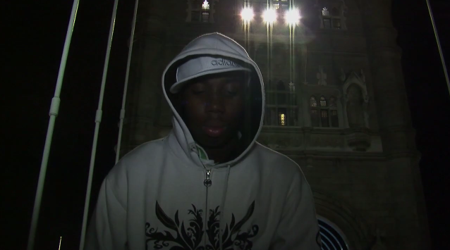

The comparison I can see here is the S.I.P logo. Its very bold and clear so that the viewers are able to read it and see a connection between the two. The fonts used are not the same however, they both share this bold similarity. The colour scheme between these two do not match. However, the writing is still in capitals and white.

The advertisement says 'No1 single Blind Faith Ft Lil Miss LG'. This not only promotes the artist but it also promotes the artist who was featuring in the music video.
Influences included:


Subscribe to:
Posts (Atom)